I was asked to talk about current UI and UX trends.
I could have done the easy thing. Show some clean examples. Say what’s popular. Keep it tidy.
The more I prepared, the more I wanted to do the opposite. Because the interesting question isn’t what’s trending. It’s what happens to design when teams stop thinking before they start designing.
The problem isn’t trends. It’s imitation without thought.
Look at modern SaaS products for a moment. How many of them actually feel distinct? How many look and behave as if they were made by the same team, using the same references, for the same imagined user?
The answer, increasingly, is: too many.
“Clean,” “simple,” “usable.” These words have quietly become cover for sameness. The interfaces work. They’re fine. But they rarely surprise, and they rarely say anything specific about the product or the people who built it.
That’s the part that bothers me. Not because every product needs to be wild. Because design is supposed to reflect judgment. And what we’re often looking at now is not judgment. It’s imitation.
 Photo by Biegun Wschodni on Unsplash
Think of a herd of sheep. As a mountain boy, I’ve watched this scene plenty of times. One or two figures lead, usually the shepherd or the dog. Everyone else moves because the others are moving. No intent. No destination of their own.
That’s what a lot of product design looks like right now.
Some convergence is actually fine
Before I go further, I want to say the obvious thing: not all sameness is weakness.
Some of what looks like copying is just the market converging on patterns that genuinely work. Shopping carts in the top-right. Primary buttons on the right of a form. Dark mode toggles. Search at the top. These aren’t failures of imagination. They’re accumulated user expectations, and fighting them costs users more than it costs the product.
Good designers know the difference between a convention that earns its place and a trend that’s just borrowed confidence. The problem I’m describing isn’t convergence. It’s the version of convergence where no one remembers why the pattern exists, and no one is asking whether this product actually needs it.
Following is the cheaper option
I understand why teams copy. It reduces risk. It makes decisions easier. It reassures stakeholders. It helps people move fast without having to sit with whether the direction actually fits the problem.
That’s not irrational. It’s efficient in the short term.
But there’s a cost. The more we rely on reference boards, design systems, and familiar patterns as a substitute for thinking, the more the work flattens. We stop being designers and become decorators. The work stays usable. It just stops having a point of view.
 Photo by Marcus Lenk on Unsplash
Take a walk through East Berlin, past rows of Plattenbau. Those buildings were designed for efficiency. Repeatable, scalable, uniform. Functionally sufficient, creatively bankrupt. If you’ve seen one, you’ve seen them all.
A lot of modern product design is drifting toward that. Functionally sufficient. Creatively bankrupt. Joyless.
Every trend started somewhere
The thing is, most design trends began for a good reason.
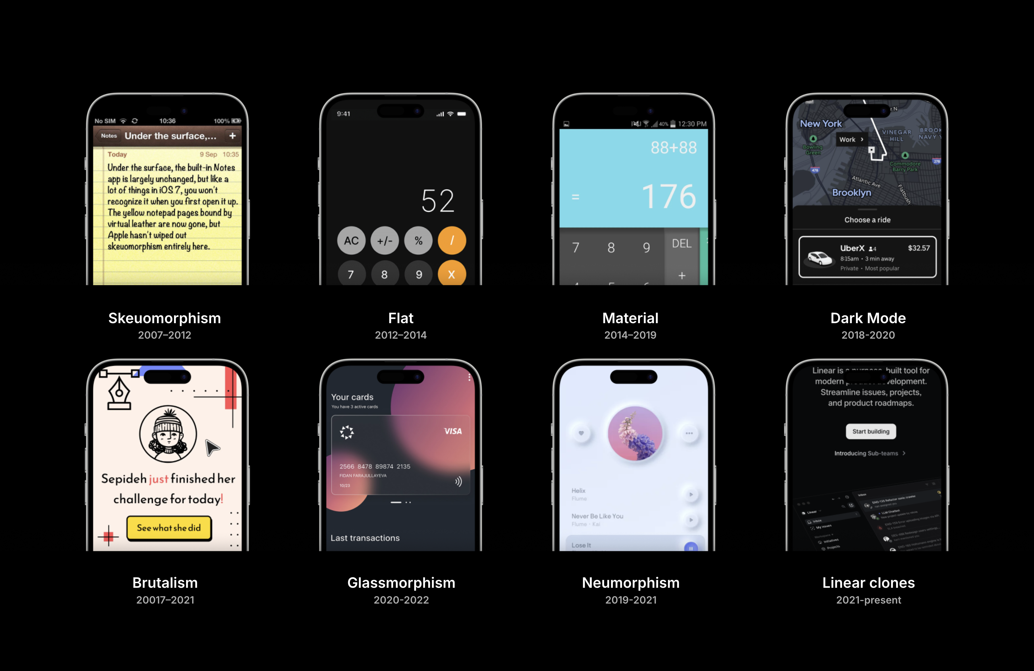
Skeuomorphism made digital interfaces feel familiar at a time when people needed translation.
Flat design stripped away noise and improved clarity.
Material Design added order, motion, and structure.
Dark mode changed the feel of products and helped in contexts where it mattered.
Brutalism, glassmorphism, neumorphism. Each was, in its own way, a response to something real.
Each started with a reason. But when a pattern becomes popular, people copy the surface and forget the reason. The solution becomes a style. At that point, the trend isn’t helping anyone think. It’s replacing thinking.
And now we’re in the SaaS Sameness Era. Copying is the default. The reasons stopped being asked.
AI makes this cheaper
AI is useful. I use it. It can be fast, inspiring, and genuinely helpful when you’re exploring options or breaking out of a rut.
But it has a bias toward the average. That’s not a moral failure. It’s what the model is designed to do. It predicts, recombines, and generates based on what already exists. Which means if the starting point is weak, AI will often make it faster, not better.
That’s where the real risk is.
It becomes very easy to produce five decent-looking directions that all orbit the same center: what already works, what already looks modern, what already feels familiar. More output. Less judgment. And the volume starts to feel like creativity, even when it isn’t.
Originality starts before the screen
If you want more original work, don’t start with the interface. Start with the problem.
What is actually happening here? Why does this matter? What is the user really trying to do? What is the friction, and where does it come from? What is the business trying to achieve? What constraint are we ignoring because it’s inconvenient?
Those are better opening questions than “what’s the current pattern for this?”
Once you understand the problem, you can look wider. Not just at other apps, but at other disciplines.
A navigation problem might teach you something from airports, museums, or physical wayfinding. An interaction problem might have more in common with instruments, tools, or choreography than with another dashboard. A feedback problem might be solved by looking at how nature does it. Every form adapted to some constraint, everything with a purpose.
That’s where better work comes from. Not from Dribbble. Not from the first obvious pattern. From the connection between the problem you’re actually solving and ideas that sit outside the usual visual vocabulary.
A few examples of thinking first
Apple with the iPhone’s notch. Most companies tried to minimize it or hide it. Apple turned it into a feature. Gave it motion, purpose, identity. A technical constraint became a brand moment. Users didn’t ask for it. Focus groups wouldn’t have predicted it. It came from someone deciding, not copying.
Figma’s multiplayer canvas. Not borrowed from another design tool, borrowed from gaming. It solved a collaboration problem by looking entirely outside the field.
Spotify’s Blend, combining two users’ taste into one playlist. A small feature, but it reframed the relationship to shared listening. That didn’t come from UI references. It came from understanding how people actually listen to music together.
These worked because the teams went back to first principles. They didn’t ask what was trending. They asked what the best experience could be, given the real constraints.
Thinking isn’t visual. It’s the job.
We are surrounded by design. Every button, form, and flow. Someone made a choice about it. And most of those choices are just… fine. Not bad. But not inspiring either.
That’s what bothers me. Design is often treated as the surface layer, the thing that happens after the real work is done.
I don’t buy that.
Design shapes behavior. It shapes trust. It shapes how quickly people understand what’s happening and what to do next. It shapes whether a product feels confident or tentative, human or mechanical, thoughtful or generic.
Which means originality isn’t an aesthetic concern. It’s a judgment concern. A product concern. A leadership concern.
If a product looks and feels like everything else, that’s usually a signal that somewhere upstream, a team stopped making decisions and started matching references.
What I try to do instead
The answer isn’t to be different for the sake of being different. That’s just another form of copying. Reactive instead of imitative.
What I try to do is simpler:
- Understand the problem before opening references.
- Write before I wireframe.
- Look outside software for how other disciplines solve related problems.
- Challenge the first obvious answer, especially when it arrives fast.
- Leave room for critique, exploration, and throwing work away.
None of this guarantees original output. It just gives the work a chance to be thought through instead of matched.
Why this is getting more urgent
AI is changing the speed of everything. Generating is cheap. Iterating is cheap. Matching existing patterns is almost free.
 “99 Cent” by Andreas Gursky in 1999.
Which means the scarce thing isn’t output. It’s judgment.
Taste. Clarity. The ability to decide and stand behind the decision. To look at five AI-generated directions and see that they’re the same idea wearing different clothes. To know when to take the pattern and when to ignore it.
That’s the edge now. Not copying faster. Deciding better.
The real compliment is being copied
There’s one more thing worth saying.
If you do this well, if you actually understand the problem and make the call that fits it, someone will eventually copy you. That’s the compliment. That’s how you know it worked.
Look at Teenage Engineering. A small team making synthesizers and speakers and toys that look like nothing else on the market. And now half the hardware industry has started borrowing their language, their proportions, their sense of play. They didn’t get there by watching trends. They got there by deciding, consistently, that their work was going to look like them.
That’s the bar. Not being noticed. Being copied.
The question
Every time I make a design decision, I try to come back to one question:
Am I doing this because everyone else is, or because it’s actually the best way?
Trends are easy. Thinking is harder.
And if the goal is to make work that matters, thinking is still the only place to start.